University Projects
A collection of projects I finished during my degree, both university-related and personal

In 2021, I obtained a Master's in Design Engineering at Imperial College London. I've selected some projects I completed during that time, both inside and outside of university. Some are related to digital product design, and others explore user-centred design principles through physical products. This post won't cover them in great detail, but serves as a summary of learnings.
‘Minna’ - Mobile app design
Overview
For this two-day sprint project, I created the concept for a fictional Japanese learning mobile app called ‘Minna (みんな)’, which means ‘everyone’. This gave me a context to work with for a series of projects that explored different user flows within the app.
This first challenge was to explore how mobile apps typically handle login user flows, and recreate one as a Figma prototype. I was still learning how to use Figma at the time, and this was a quick way to test my proficiency. It also allowed me to gain a better understanding of basic design systems and common login patterns.
tl;dr
Design of login flow for language learning app
UX and UI, design systems, graphic design
Figma, WCAG, Adobe Creative Cloud
Deliverables
The main goal was to produce an interactive prototype in Figma, which you can see below.
I also created some basic branding assets for my fictional app, such as a logo, colour palette, typography selection, etc.
Takeaways and limitations
This project was a great way to quickly test my skills and become familiar with login flows. However, there are some things I would do differently if I were to replicate it today.
- Add field labels that are not contained in the placeholder text. As a user begins typing, the placeholder disappears and takes the context away, which can cause confusion.
- Adjust the back button target area to meet the WCAG criterion of minimum 24px.
- Add more interactivity to the prototype to showcase different states and edge cases.
Footprint - Browser extension design
Overview
One of the topics we explored in our Design Psychology module was the effects of social media in children and teenagers. For this assignment, teams were tasked with creating a concept for promoting online safety within this age group.
Most platforms require users to be at least 13 years old, yet half of children 11-12 own a social media profile. We conducted research by creating profiles in different platforms, and found that many of them have low privacy settings enabled by default.
My team proposed a browser extension that translates privacy settings into simple terminology and provides clear examples that children can understand, as well as a companion website with the same functionality.
tl;dr
Design of a browser extension for privacy advice
UX and UI, graphic design, research
Figma, WCAG, Adobe Creative Cloud
Deliverables
I created a mockup to illustrate the browser extension concept during our presentation. I have remade it below with better accessibility considerations.
Takeaways and limitations
Our proposal has an obvious flaw. Younger audiences mostly use social media in their smartphones. Moreover, this browser extension would require parents to install it, as children would not seek it out for themselves.
If I were to remake this proposal, I would suggest a mobile app that uses a pin to avoid sneaky uninstalls. Some existing apps, such as ScreenZen, use overlays and prompts that invite reflection. Footprint could work in a similar way, although less intrusive as the goal is simply to keep the child aware through contextual prompts. Another idea would be to link existing accounts and have the app scan for risks in their settings.
DayLite - Physical product design
Overview
DayLite is a stretching device concept designed for London Underground drivers. It aims to prevent muscle atrophy and promote a healthier posture. The concept was the result of an assignment where we were tasked with reusing components from an old device to create something new that followed user-centred design principles.
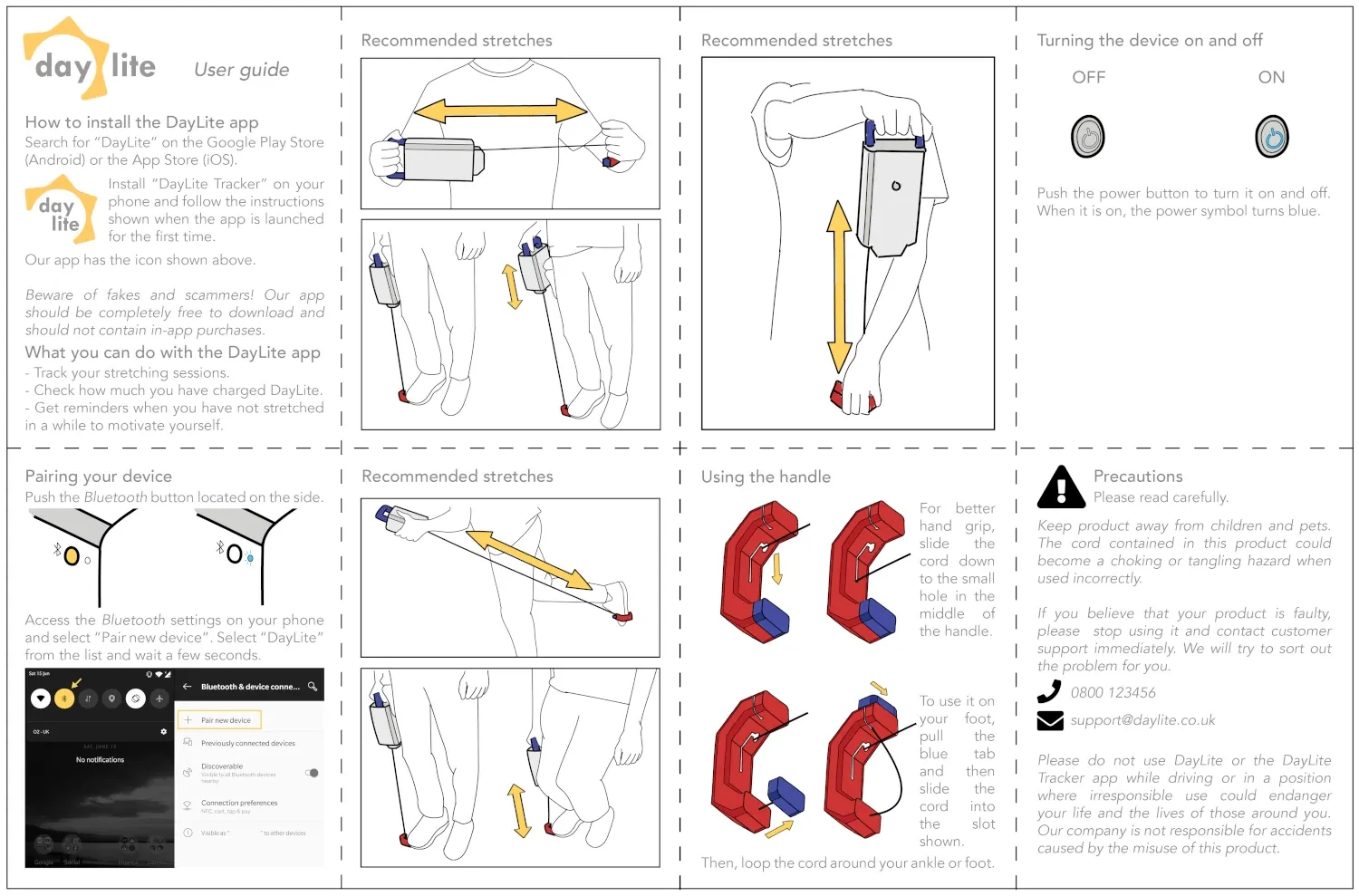
My role within the team was that of a creative director. I was mainly involved in ideation, branding, packaging, and assisting with user research. I also designed all of the supporting materials, such as our presentation slides and the device user guide.
tl;dr
Design of a stretching device for train drivers
User testing, user research, branding, packaging
Adobe Creative Cloud, SolidWorks
Deliverables
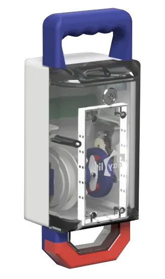
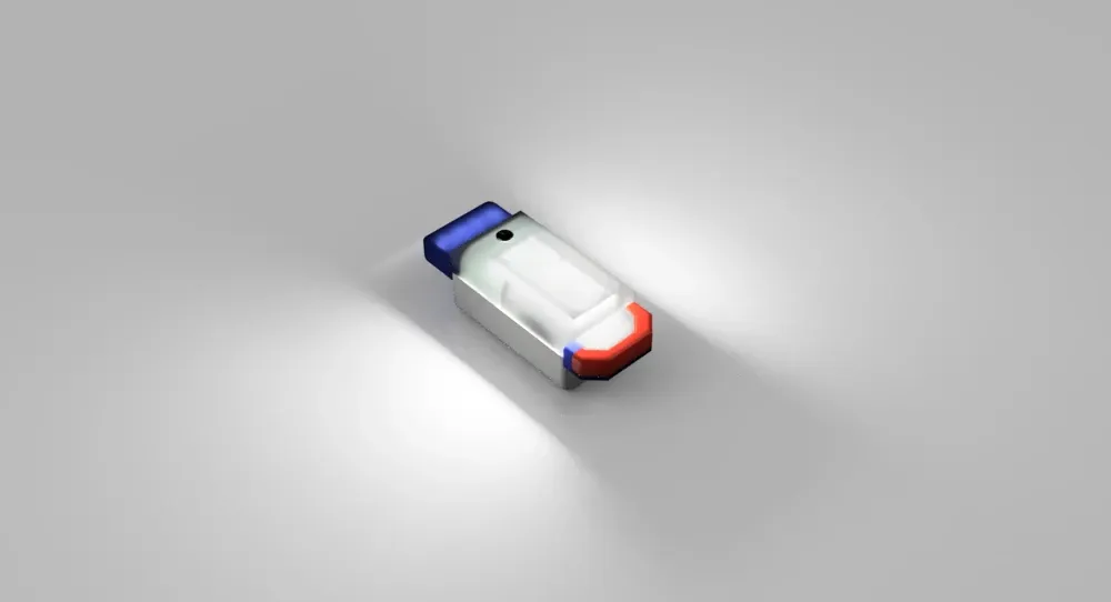
Our main deliverable was a physical prototype that reused components from an old wind-up radio, with a completely new 3D-printed casing. You can see some renders below.
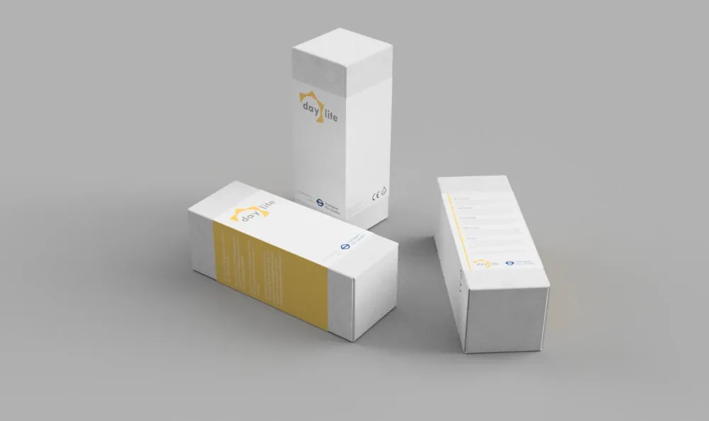
Below are some renders of the packaging I designed inspired by sunlight and the London Underground, as well as the user guide that I illustrated.
Takeaways and limitations
The project was built on user research, user testing, and iteration. We met with train drivers to understand their pain points and test the prototype. Our team also conducted research to identify stretches targeting the areas where muscle atrophy is more common in drivers.
A key takeaway was the importance of user testing. This allowed us to quickly validate our ideas and gain valuable insights, especially as we were able to observe the drivers using the prototype in real time.
The main piece of feedback we received was that the device was bulky. Unfortunately, this was due to the recycled components we were limited to.