todoos
A cute and simple to-do list web app developed in JavaScript, HTML, and CSS
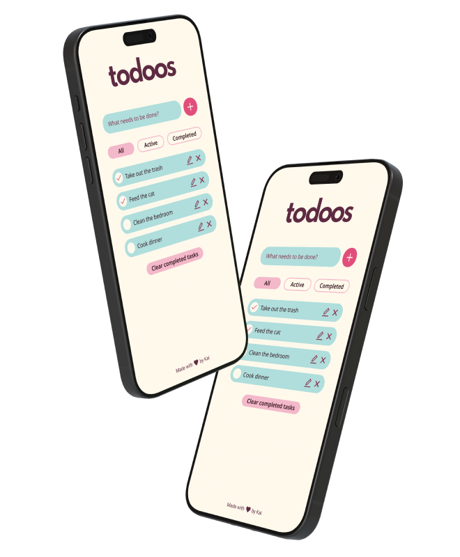
With the goal of improving my front-end development skills, I took on a small project to create a to-do list web app. Its features include: adding tasks, filtering them by status, editing them, and deleting them. I aimed to differentiate todoos from other similar projects by expressing character through the UI. It's a cute and colourful app, so that checking off those tasks feels a bit more fun.
tl;dr
Design and development of a to-do list web app
UX and UI, design systems, front-end development
Figma, CSS, HTML, JavaScript, WCAG
The design process
Discovery and research
I kicked off my project by defining its core features. As part of this first step, I looked at a variety of existing apps and took note of repeating UX patterns.
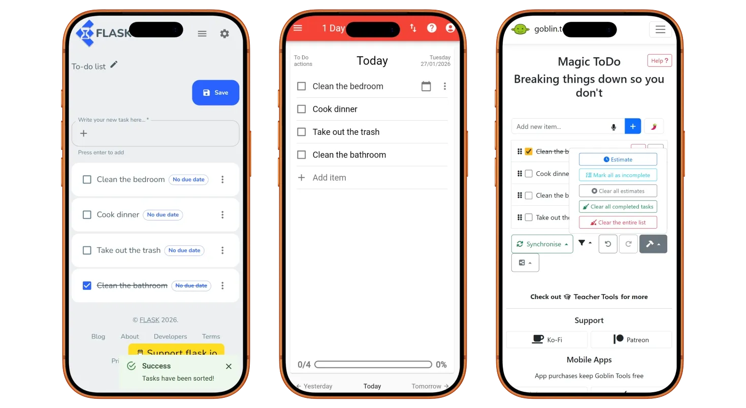
In its most basic form, my app needed a way to input tasks and a way to mark them as completed. However, I quickly noticed several features that seemed to be present in many of the projects I explored.
- Edit and remove tasks
- Filter tasks by status
- Remove all completed tasks at once
- Track overall completion
I wanted to keep my app straightforward, so I only implemented the first three in this list. Tracking overall completion loses meaning when users are able to add and remove tasks as they wish, so I did not consider it to be essential.
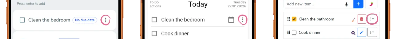
Many of the projects I explored used a menu to hide task actions. I felt that it added unnecessary friction, so I went for always-visible buttons instead. Of course, if my app were to include more features, the menu pattern might be necessary.
Layout
I translated these features into simple digital wireframes and created an interactive prototype with Figma. While I opted for a mobile-first approach, I wanted to get a sense of the layout and how it would adapt to larger sizes.
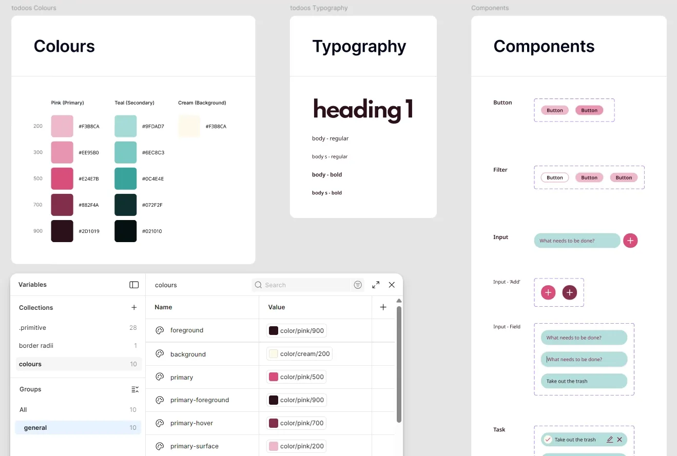
Design system and styles
Once I was happy with the layout, I created a simple design system in Figma. Although basic, it helped refresh my understanding of tokens and components. During this process, I followed the WCAG 2 for colour contrast and target size. You can see a sneak peek below.
I then used these components and styles to put together my final design, which you can try for yourself here.
The development process
I was already familiar with plain HTML and CSS, so they were the obvious choice. I also used JavaScript for more complex areas such as handling the display of tasks, filtering, and so on. The main challenge here was learning JavaScript as I went, and there was definitely a lot of trial and error involved!
During the development process, I repeatedly tested the layout in the most common desktop and mobile screen sizes, as reported by Statcounter. I also made sure that all elements were keyboard focusable for increased accessibility.
You can play around with the final version here or take a look at the source code here.
Limitations
While working on todoos, I decided to give myself a time limit. I had not used JavaScript extensively before, which meant I would have to learn many new concepts as I went, and I did not want that learning to be hindered by a lack of focus.
That said, there is always room for improvement. If time allows, I would like to tackle the following issues that arose during a moderated user testing session with a few friends.
- Improve accessibility by increasing the contrast of the caret, making hover and focus states more obvious, and allowing users to mark tasks as completed via keyboard.
- Retain the active style of the filter buttons to always indicate what filter is active.
- Do not allow users to add empty tasks by disabling the ‘Add task’ button and ‘Enter’ key until there is a string of text present.
- Instantly remove tasks from filtered views if a change occurs to their status.
Takeaways
The main goal of this project was to test and improve the front-end development skills that I had abandoned some years before, and I was pleasantly surprised with how much my brain was able to recall. I also find that I learn more efficiently with practice, so it was a great way to ease myself into becoming more comfortable with JavaScript.
That said, I would like to improve the accessibility of the app in the future as I believe this to be a non-negotiable aspect of user-centred design.