todoos
Sparking joy with a playful to-do list web app
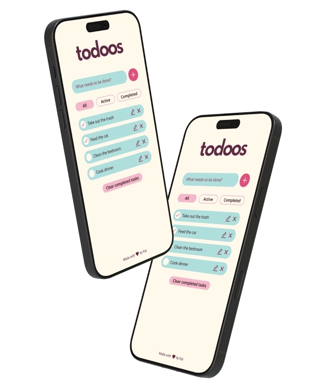
Most to-do apps are functional but joyless. As part of a small project to sharpen my web development skills, I wanted to see if a bit of personality could make the same task feel different.
tl;dr
Solo Web Designer and Developer
UX/UI, design systems, web development, accessibility
Figma, CSS, HTML, JS
Learning by doing
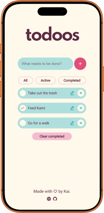
todoos was a week-long project motivated by recently acquired JavaScript skills, and the fact that I learn better by getting my hands dirty. I challenged myself to develop a simple to-do list web app that didn’t stop at being functional, but made completing tasks a bit more fun through a playful interface.
DiscoveryWhat features make up a to-do list app?
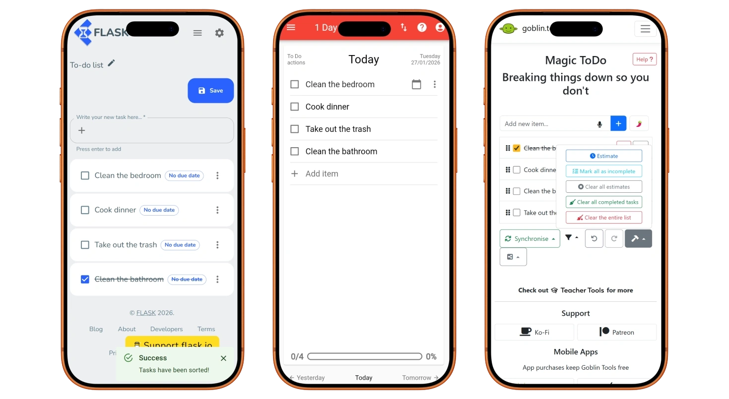
I kicked off my project by defining its core features. As part of this first step, I looked at a variety of existing apps and took note of repeating UX patterns.
In its most basic form, my app needed:
- A way to input tasks.
- A way to mark tasks as completed.
I quickly noticed several features that were present in many to-do list apps, and that elevated the user experience and made them more functional.
- Edit and remove tasks.
- Filter tasks by status.
- Remove all completed tasks at once.
- Track overall completion. E.g. “1 of 3 tasks completed”.
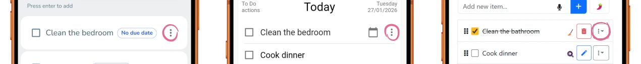
What didn’t make it in
Tracking overall completion is useful for fixed or time-gated lists. However, it becomes redundant when the user is given complete freedom to add and remove tasks, as this would constantly change what “completion” means. I decided to leave this feature out.
Many of the projects I explored used a menu for task-related actions. In the case of my app, there were only two actions available, so it added unnecessary friction. If the app were to scale to include more actions, the menu pattern would become more useful.
Sparking joy
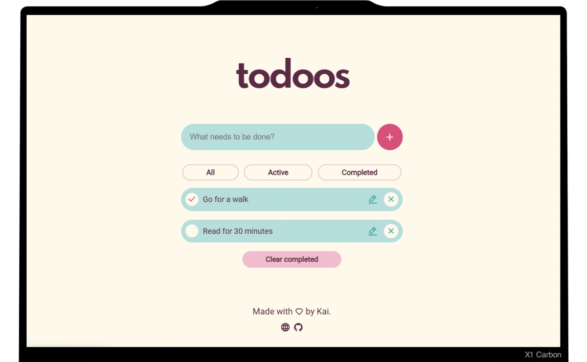
I translated these features into simple digital wireframes and created an interactive prototype with Figma. While I opted for a mobile-first approach, I wanted to get a sense of the layout and how it would adapt to larger resolutions.
Once I was happy with the layout, I created a simple design system. Since I wanted to create a playful interface, I used bright colours, rounded elements, and bold fonts. You can see a sneak peek below.
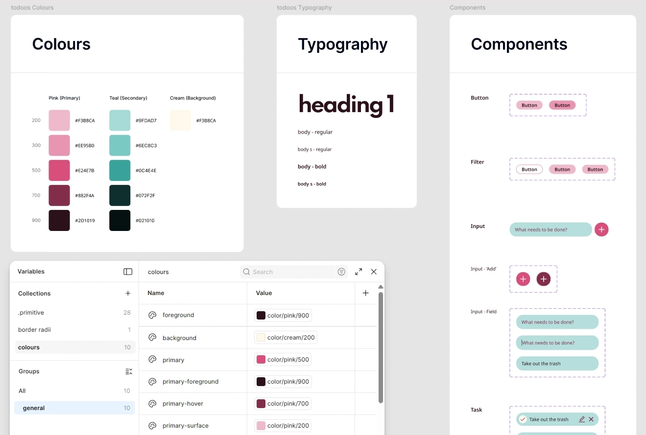
During this process, I made sure to follow the WCAG 2 for colour contrast and target size, among others.
DevelopmentBringing it to the browser
I was familiar with plain HTML and CSS, so they were the obvious choice. I also used JavaScript for more complex areas such as handling the display of tasks, filtering, and so on. The main challenge here was learning JavaScript as I went, and there was definitely a lot of trial and error involved!
During the development process, I repeatedly tested the layout in the most common desktop and mobile screen sizes, as reported by Statcounter. I also made sure that all elements were keyboard-focusable for increased accessibility.
You can play around with the final version here or take a look at the source code here.
User TestingTesting with friends
Since this was a personal project, I ran a casual moderated user testing session with some friends. I could say everything went smoothly, but the truth is that they raised some concerns that are worth recognising.
- The caret is hard to see, and some hover and focus states are not obvious enough.
- The filter buttons go back to an inactive state when clicking somewhere else, which means the user needs to recall which filter is currently applied.
- Users are unable to mark tasks as complete using just their keyboard, which is an accessibility concern.
- Users can add tasks with empty strings of text.
On my to-do list
While working on todoos, I gave myself a time limit. I had not used JavaScript extensively before, which meant I would have to learn many new concepts as I went, and I did not want that to be hindered by scope creep. That said, there is always room for improvement.
If time allows, I would like to tackle the issues mentioned above, especially those related to accessibility as this is simply a non-negotiable aspect of user-centred design.
Since I finished this project, I have learned a lot about interaction and motion design, and would love to explore those as ways to increase the feeling of joy and gratification.
Saving tasks in the browser local storage would be great, too!
ConclusionChecked off
My main goal was to test and improve the front-end development skills that I had abandoned some years before, and I was pleasantly surprised with how much my brain was able to recall. I learn more efficiently with practice, so it was a great way to ease myself into becoming more comfortable with a new programming language.