Ticket purchase flow
Decreasing cart abandon and customer support requests with targeted improvements
Our tracking data revealed cart abandon rates above our internal goal, while our customer support inbox hinted at lack of information for users. I led a number of UX and UI improvements that decreased both of these metrics and streamlined the user experience.
tl;dr
Sole Product Designer
1 Designer, 1 PM, 3 Engineers
End-to-end UX and UI design process
Figma, FigJam, PostHog
A fairer ticket purchase experience
Planet enhances the experience of both artist teams and fans within the live music industry, facilitating ticketing and fan engagement via a self-serve B2B dashboard linked to a B2C web application. We have offered our services to the likes of Universal Music Group, Sony Music, and Amazon Music, among others.
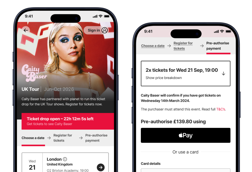
Time-gated ticket draws are one of our key offerings. Fans can register at any time while the ballot is open and pre-authorise the payment. Once the ballot closes, payments are automatically captured or released. This removes the “first-come-first-served” philosophy that rules the live music industry, giving everyone a fair chance.

”Does this include the meet and greet?”
After running many ticket draws, we noticed that we were receiving a large number of customer support emails related to ticket and show details. This hinted at a lack of information throughout the flow, and prompted us to look into the journey as a whole.
Our Product Manager created funnels in PostHog that revealed where fans were getting stuck. While still below the industry benchmark, we saw higher cart abandon rates than we aim for.
At this point, we decided to invest time into an upgrade to the ticket purchase flow.
As the sole Product Designer, I led the design process end to end. I collaborated closely with engineers and our PM to ensure feasibility and alignment, and our commercial team to guarantee that artist teams’ needs were met.
Gathering more insights
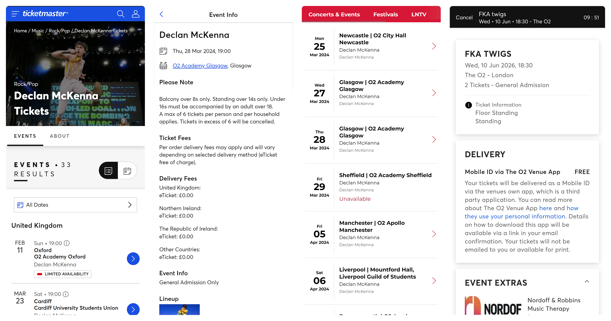
Before jumping into Figma, I conducted competitive analysis to identify common UX patterns, particularly around display of information and payment. I looked at Ticketmaster, Live Nation, and Eventim, among others.
The competitive analysis surfaced patterns that would be familiar to fans.
Some platforms had dedicated spaces for event and ticket details, often in the form of large dialogs or even full pages, highlighting the importance of informed ticket purchase.
It also highlighted others that were not compatible with our fan-first approach.
Most of the platforms offered extra options during checkout, meaning I had to scroll very far down to complete my purchase. Due to the “first-come-first-served” nature, many had timers after which tickets would be released.
Small improvements for big impact
Rather than a complete redesign, we opted for targeted improvements that our engineering team could tackle incrementally.
The right information at the right time
The customer support emails highlighted a lack of information for fans. This went hand in hand with a lack of customisation for artist teams, as they had no space to surface additional details. Therefore, my solution had to remain flexible to account for a variety of use cases.
How might we surface the right information at the right time, while keeping the interface clutter-free and the content flexible?
My answer was the prototype below, but you should keep reading to find out why!
Let’s take a closer look at the changes.
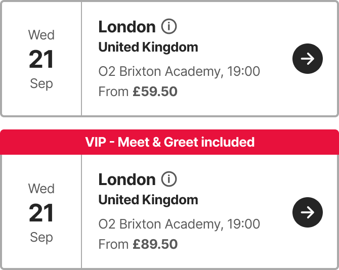
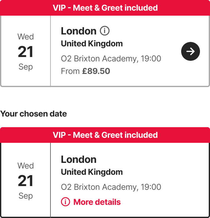
Optional event “flag”
To clearly communicate offerings such as VIP packages, I added an optional flag to the event details component. It’s eye-catching, surfaced from the very first step, and persists for the entirety of the flow.
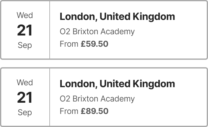
- User can only rely on the price and guess which option includes meet and greet.
- Meet and greet option is obvious at a glance.
Thanks to its flexibility, this flag has been used in many unexpected ways, such as surfacing unusual age restrictions or pre-sale codes.
Event information
For complex event details, age restrictions, and accessible tickets, I designed a modal dialog that can be opened from every step. This created a space for the information to live in, accessible as early as the event selection stage.
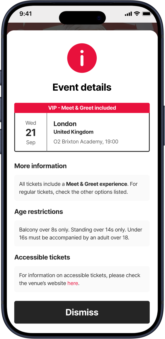
- During event selection, 'info' icon stays subtle.
- Later, during ticket selection, 'More details' link catches the user's attention.
- Easily skimmable with organised sections.
- Fully customisable copy with rich text support.
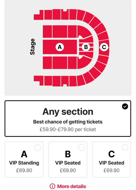
Ticket type information
The modal dialog also came in handy for ticket tier details. Special conditions are sometimes tied to specific ticket types. For example, restricted views, age restrictions for standing areas, or VIP seating areas that come with a meet and greet bonus.
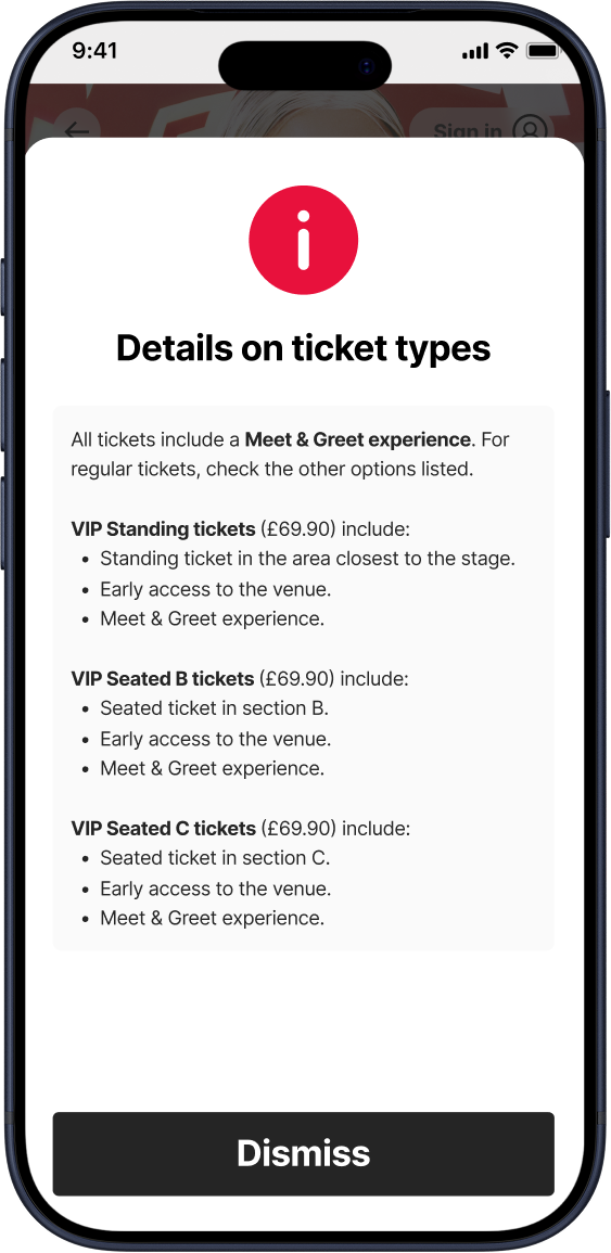
- 'More details' link is highly visible and shown in context.
- Fully customisable copy with rich text support is suitable for any use case.
It’s all in the details
Alongside the changes above, I included some more tweaks which elevated the user experience and modernised our interface.
- Allow access before the draw is open. Fans can see the list of shows (and starting prices) in advance, reassuring them of where to find the ticket draw once it opens.
- Custom event names shown alongside location. Fans can clearly tell apart special events like charity shows, and artist teams have more flexibility.
- ‘High demand’ label. Encourages fans to enter for low demand events and maximise their chances.
- Surface door times. Frankly, not sure how this one had gotten past us… 😅
- Making it more obvious that selectors are clickable. Just in case.
Easy, trustworthy payments
Next up, I aimed to reduce cart abandons by streamlining the user experience, eliminating distractions, and increasing trust.
Ticket draws are meant to remove the need for a 9 AM rush, but fans are used to buying tickets in that manner. Optimising the flow to make it quick and painless is still key, so we wanted to keep the most important details and actions above the fold.
How might we streamline payment pre-authorisation, while still surfacing the information fans need?
This was the Figma prototype I presented to the team as my answer.
Here are some more details on the improvements.
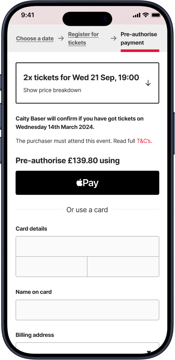
Streamlined pre-authorisation
Fans can save their details for future payments, but this doesn’t benefit new sign ups. To address this, we integrated with Apple Pay and Google Pay, allowing fans to skip the form altogether.
Additionally, I redesigned the price breakdown to be collapsible, allowing for a quick initial scan. This also allowed me to include more information about how the ticket draw works in the expanded state, without overcrowding the page.
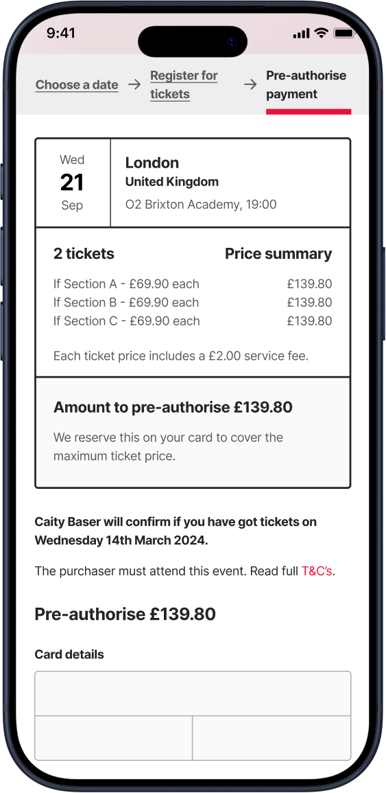
- Summary takes up half of the page.
- Tedious payment form.
- Collapsed summary uses natural language.
- Quick payment options above the fold, and quicker access to full payment form.
Capturing cart abandons
While working on this redesign, I conducted research into abandoned cart emails. I found that almost 30% of clicks on cart abandon emails convert into a sale. Planet has an advantage here in that we can reassure the fan that they’re still in time to enter the draw, whereas other platforms can’t guarantee there will be tickets left.
We implemented an email that fired off a few hours after a user abandoned their pre-authorisation, reminding them of the closing time.
The cherry on top
Other small tweaks to the pre-authorisation step included:
- Loader animation in payment button. Reassures fans with slow connections that their pre-authorisation is being processed and avoids constant refreshing.
- ‘Powered by Stripe’ badge. Shows transparency and increases trust.
Putting it all together
Below is an interactive Figma prototype of the full flow. It was a simple prototype made to communicate the improvements to the team, so not everything is clickable. Click anywhere on the screen, and interactive elements will be highlighted in blue.
ImpactBut, did it actually work?
The redesign of Planet’s ticket purchase flow showcased the value of targeted improvements. The approach allowed our small engineering team to work through the changes at a great pace, and delivered the results we expected.
We saw lower cart abandon rates on average after the changes shipped.
We saw less customer support emails regarding ticketing, especially those enquiring about ticket conditions, age requirements, and accessibility. That translated to less manual work for our team.
The number of steps to find age restrictions and accessibility details was reduced to 1, and the checkout funnel required significantly less effort from digital wallet users.