kaiajimenez.com
Designing and building my personal branding and website from scratch
Designing a website is fun. Designing a website that you have to build yourself is a bit humbling (but still fun). I've been developing what I hope will become my very own corner of the internet, fuelled by a dream of reliving my memories of a more personal, creative web.
tl;dr
Solo Web Designer and Developer
IA, design systems, UX/UI, web development, accessibility
Figma, HTML, CSS, JS, Astro, GitHub Copilot CLI, Figma MCP
A short backstory
In 2021, I graduated from my Master’s in Design Engineering and entered the job market, having found my calling for product design. I had spent three months juggling my portfolio with the final stretch of my thesis. As a result, it looked like this. 👇
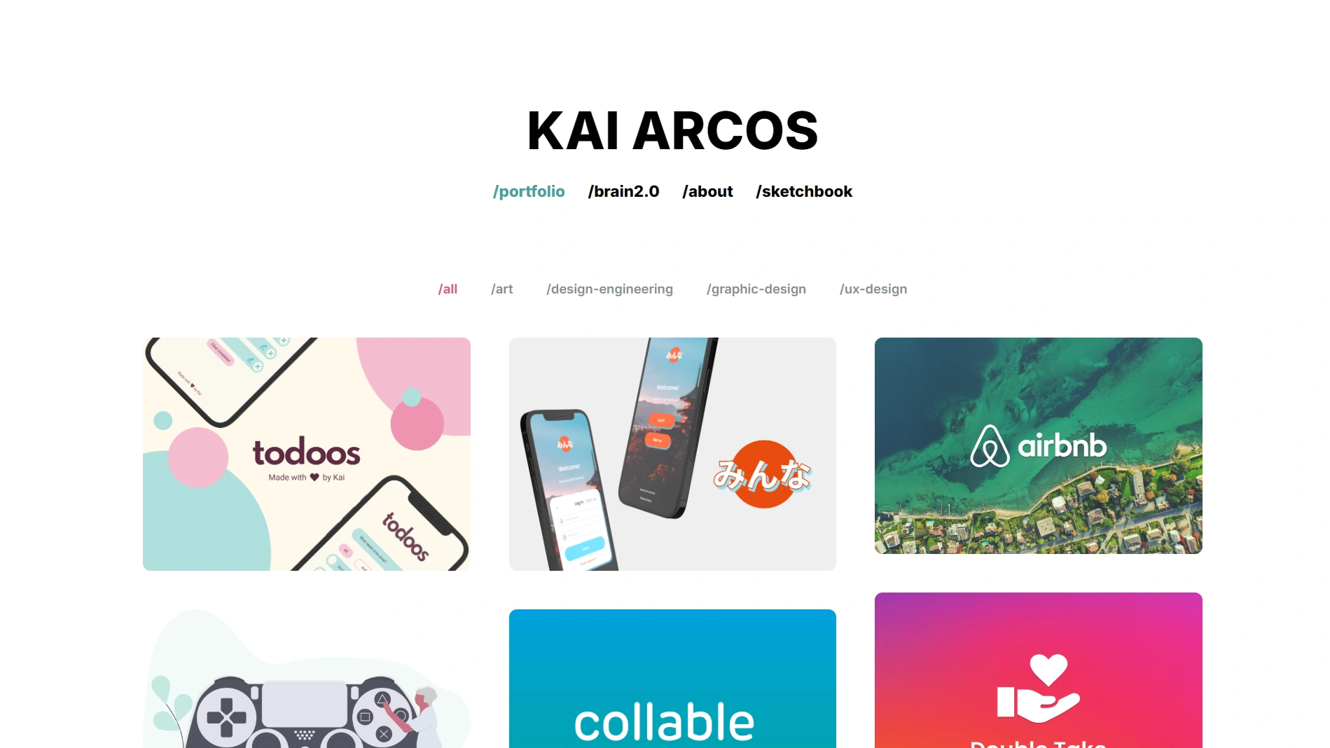
It had many issues, but these were the ones that made it a chore to maintain:
- It was first and foremost a portfolio. The home page showcased twelve projects across various disciplines, most of which do not represent me anymore.
- It was not flexible. I began wanting to share blog posts and other creative work, and the strong portfolio focus made it difficult. The information architecture was a mess.
- It did not reflect who I am. It’s not difficult to see that the previous design was lacking personal identity. I wanted my website to actually feel like me.
- It was built on WordPress. I had chosen a platform I was already familiar with, and used a pre-existing template that I had customised to fit my needs. However, I often found myself fighting against its limitations.
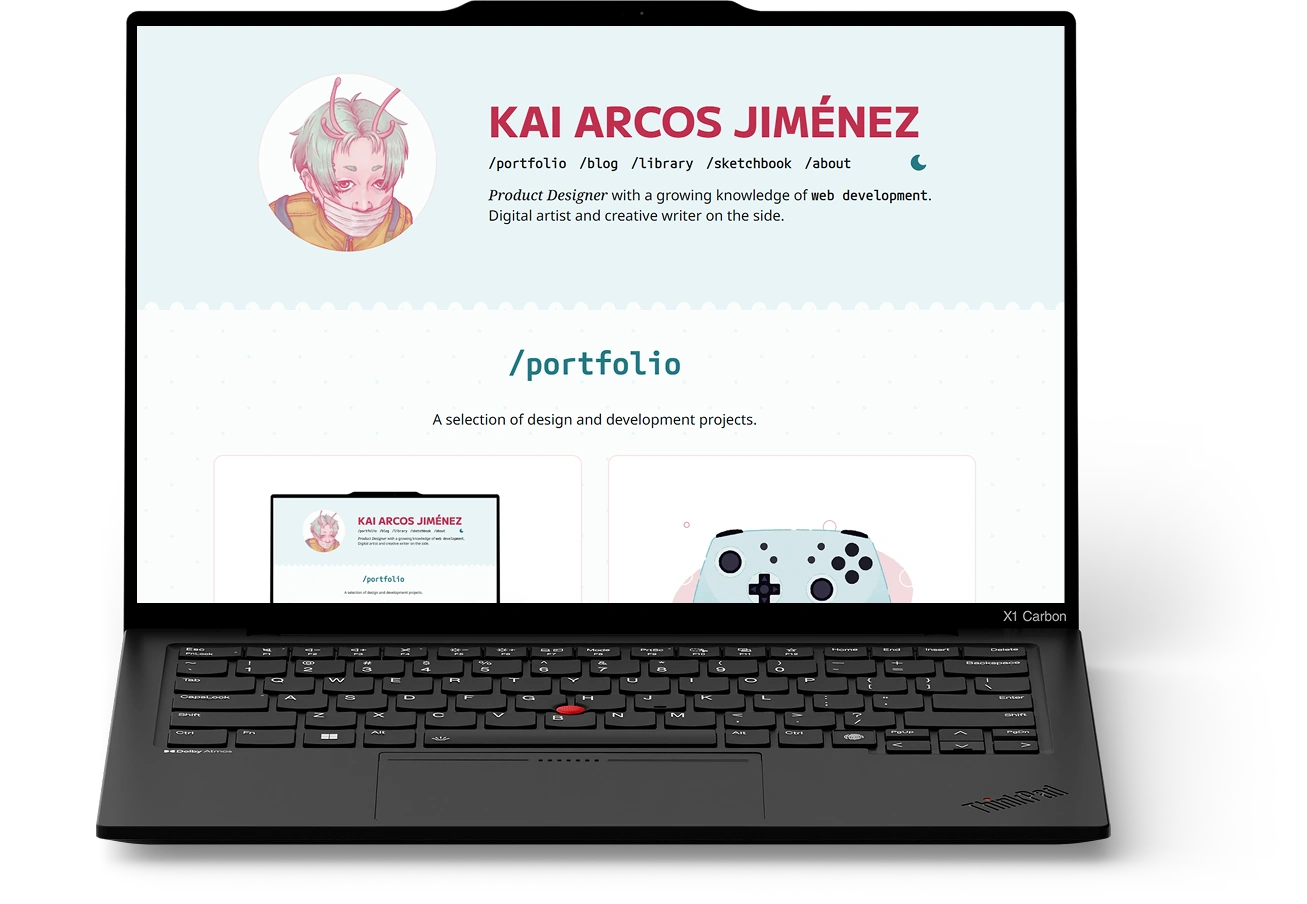
After putting it off for years, I completely scrapped my old portfolio in 2025 and built this one with a brand new approach.
RequirementsA new philosophy
Before I got started, I wanted to have a clear idea of what kind of site I wanted to own.
First off, I wanted it to reflect who I am, what I like, and what I care about. The site should grow with me, with space to update posts as I learn new things and room for new types of content. I also wanted to retain full control of the design. Oh! And it had to have a blog. Blogs are a part of the web I grew up with that I really miss. Let’s bring them back!
Design, Part IMe-centred design
My personal design choices were guided by the following question.
If I hired someone to build this site for me, what would it look like?
I did not want to think about limitations just yet. It was a nice change of pace from my professional work, where balancing feasibility with user needs is key. Some features that would not have been possible without this mindset are the custom cursor and the nice transition effects in /library cards.
In terms of process, I started with the information architecture, which helped me understand what layouts I would need to design for my content.

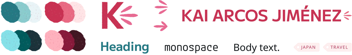
I then defined what the site should look like. I looked for similar websites and sketched out ideas on paper. Then, I explored those on Figma and iterated until they felt just right. This was my approach for the UX, but also for the personal branding elements that set the direction for the UI design and really brought it to life.
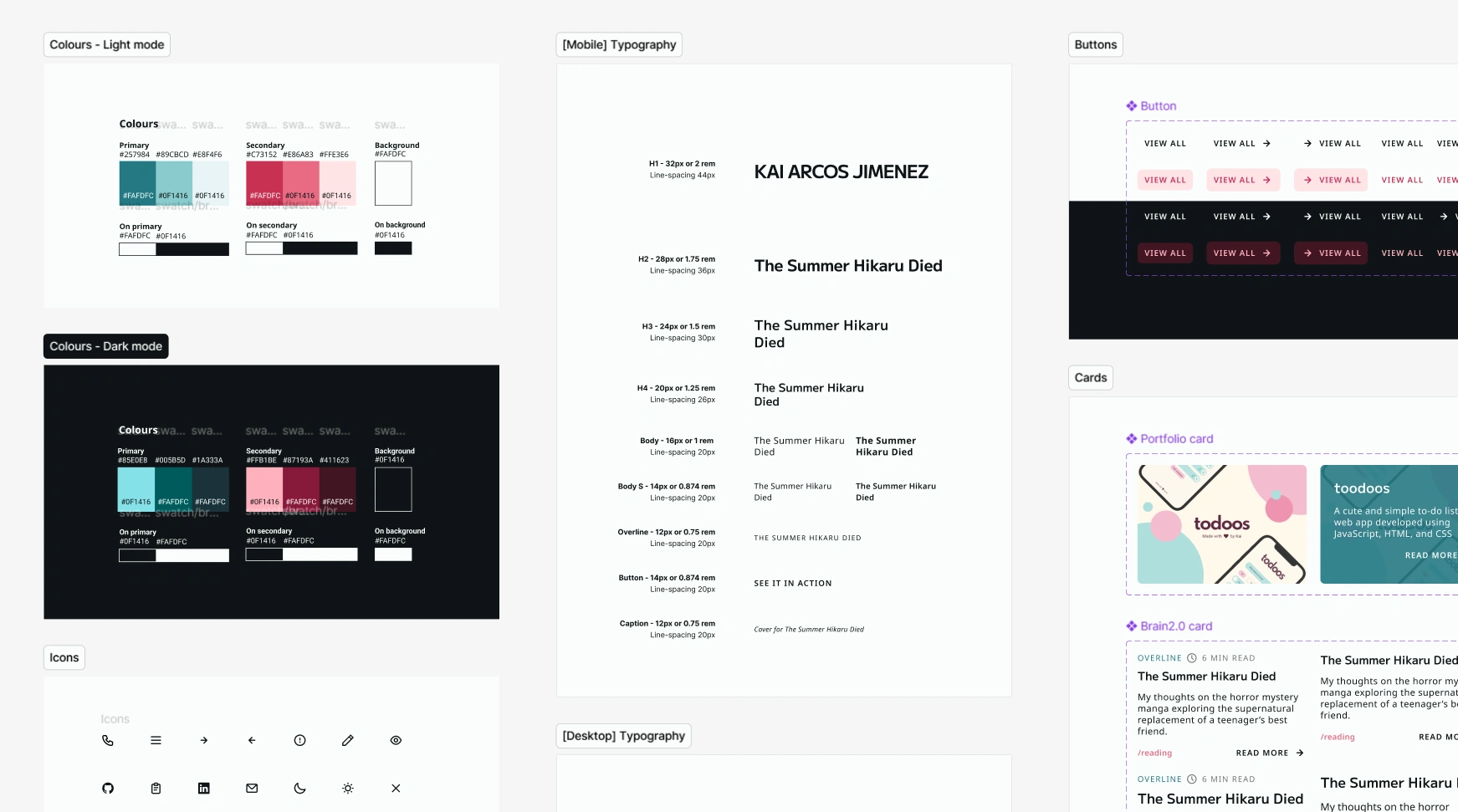
The biggest challenge here was creating post layouts that would adapt to different types of content, but still felt cohesive. Reusable components were key in achieving this, so I created a basic design system to make things easier for myself.
But also, user-centred design
There’s no point in creating a website that does not welcome its visitors. Apart from keeping UX best practices in mind, I asked myself the following question.
What have I learned during these years as a product designer that should apply to my site?
The first answer was accessibility. The WCAG exist to make the web welcoming to everyone, and this resonated with the kind of space I hoped to create. I used accessible colour contrast and font sizes, as well as clear hover and focus states. During development, I also took the chance to learn about and apply ARIA labels.
The second answer was clear information architecture. During my years working in complex products, I’ve come to appreciate just how important this is. This time, I accounted for different types of content from the start and kept things scalable.
I’ve also learned more about micro-interactions and motion design as a way to provide feedback and delight users, so I’ve implemented these learnings while avoiding excessive distractions.
DevelopmentWearing the web dev hat
Remember that first question I asked myself? Well, it was time to deal with the consequences of my answer.
I used plain HTML, CSS, and JS to build the interface. I also used GitHub Copilot CLI paired with Figma MCP to help me tackle more complex areas and bug fixes. Apart from its usefulness as a coding assistant, its planning mode is a great way to get some direction when you would still like to code the solution yourself.
I have learned a lot from this website, but I would be lying if I said there were no hiccups along the way…
First attempt: Hugo
I had never built a content-driven site from scratch, so I enlisted the help of my wonderful partner, who recommended Hugo. At first glance, it looked simple enough.
What drew me to Hugo was the way it handles content. Posts are generated from Markdown files that I can edit within VS Code, avoiding complex editing flows.
Unfortunately, working with Hugo quickly became a frustrating experience. Its Go template syntax felt unintuitive to me, and it didn’t help that the documentation seemed written for a more experienced audience. I even started questioning the “0 to 1” approach, wondering if I had bitten more than I could chew.
I looked back on the reasons I had decided to move away from WordPress in the first place, and realised that Hugo did not actually solve the problem of feeling like the platform was working against me and my ambitions for the site.
Second attempt: Astro
While trying to find a solution, I searched for inspiration and came across many sites that used Astro, a static site builder for content-driven websites. The more I investigated, the more it seemed like the right option for me.
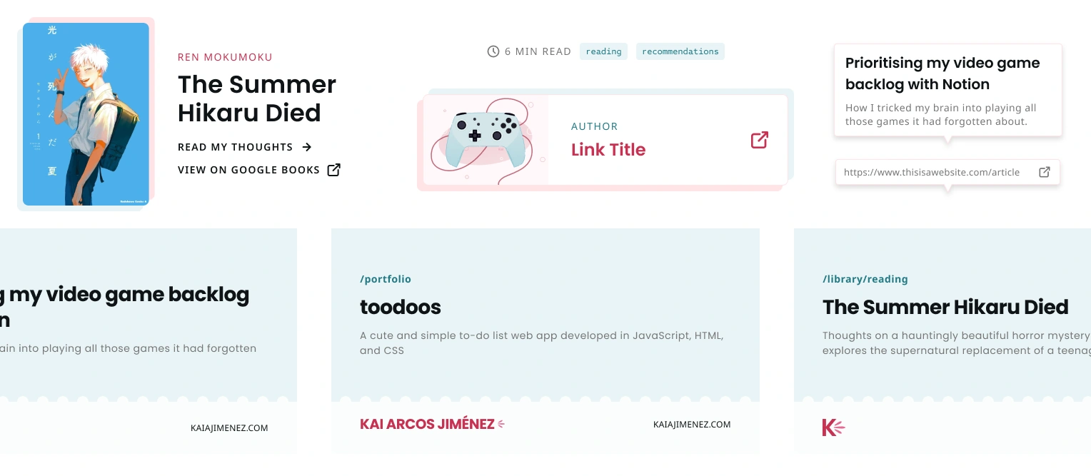
The main advantage was that I wouldn’t be forced to learn new syntax, as it uses TypeScript. Astro’s component-first philosophy matched my design approach too, and it allowed me to extend my Markdown with MDX to easily use components within my content. That’s what lets me add callouts and image grids to my posts, among others.
Overall, I have been very pleased with it. I can edit my content directly within VS Code, just like Hugo allowed, without jumping through hoops to add interactive elements to my site.
What’s nextOn my to-do list
This new version of kaiajimenez.com is now live, but there is always room for improvement. One of my ambitions was to create a site that grows with me, after all.
Below are some of the areas I’d like to explore in the future:
- Smoother transitions and animations for micro-interactions.
- /blog improvements, like post tags and an RSS feed.
- Dynamic previews for social media sharing with Open Graph images.
- Showcase more dynamic content in my posts, such as link previews.
Thank you for taking the time to read about this site’s journey. ✨ If you’re interested in the technologies used and the story behind the smaller design decisions, visit /colophon.